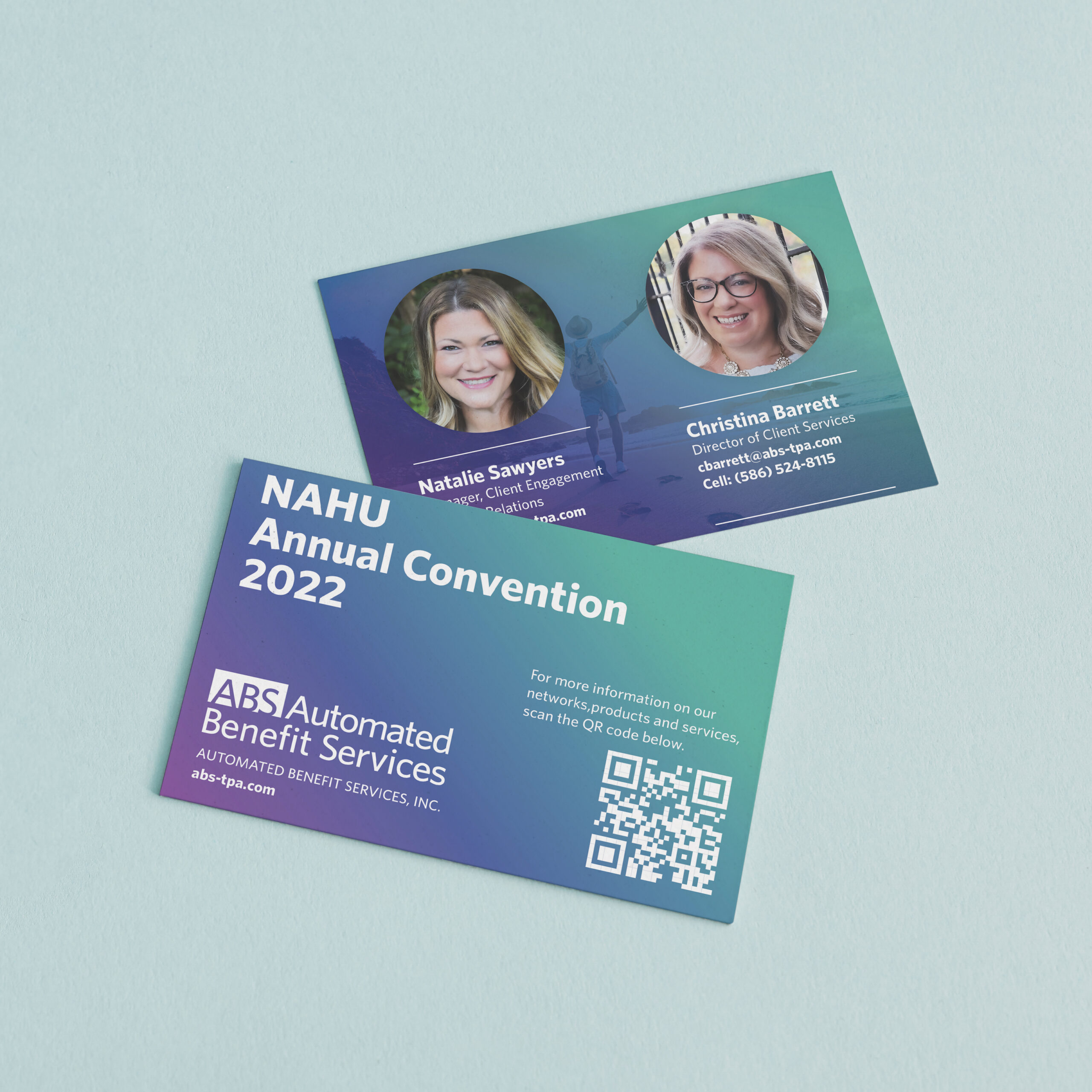
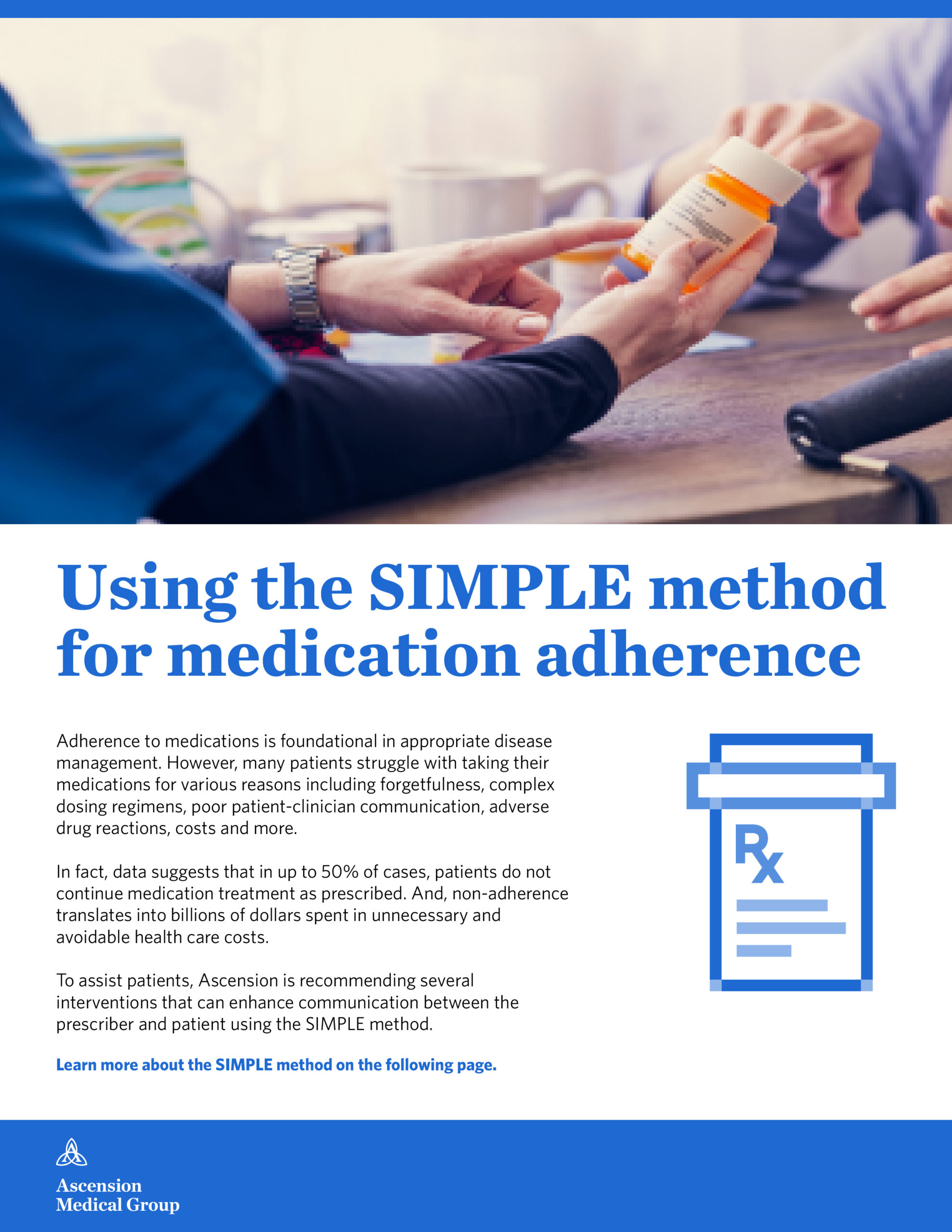
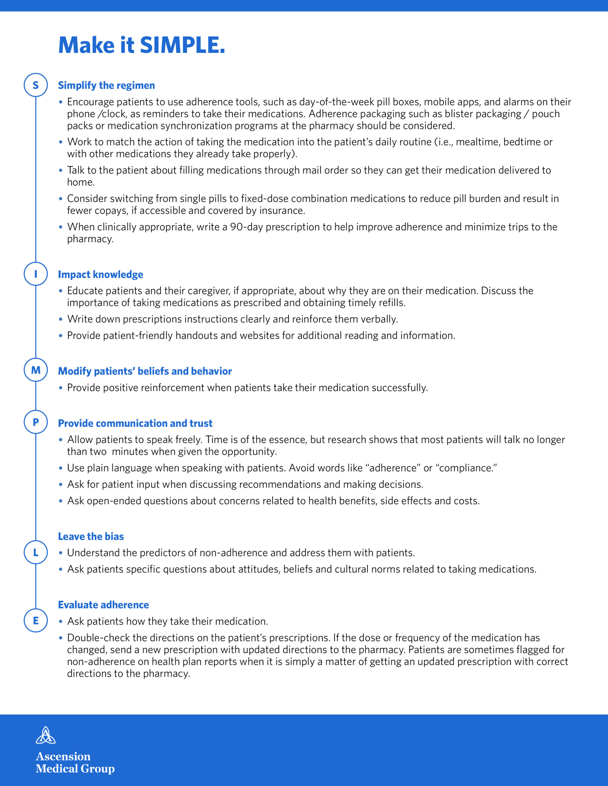
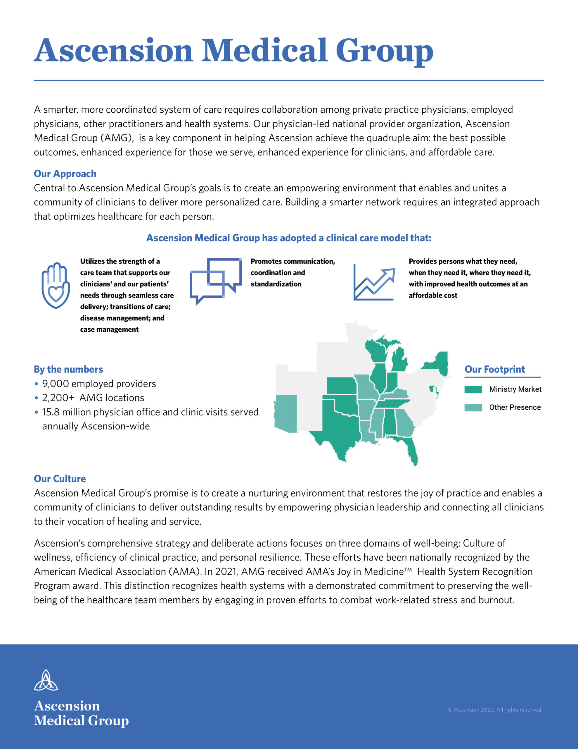
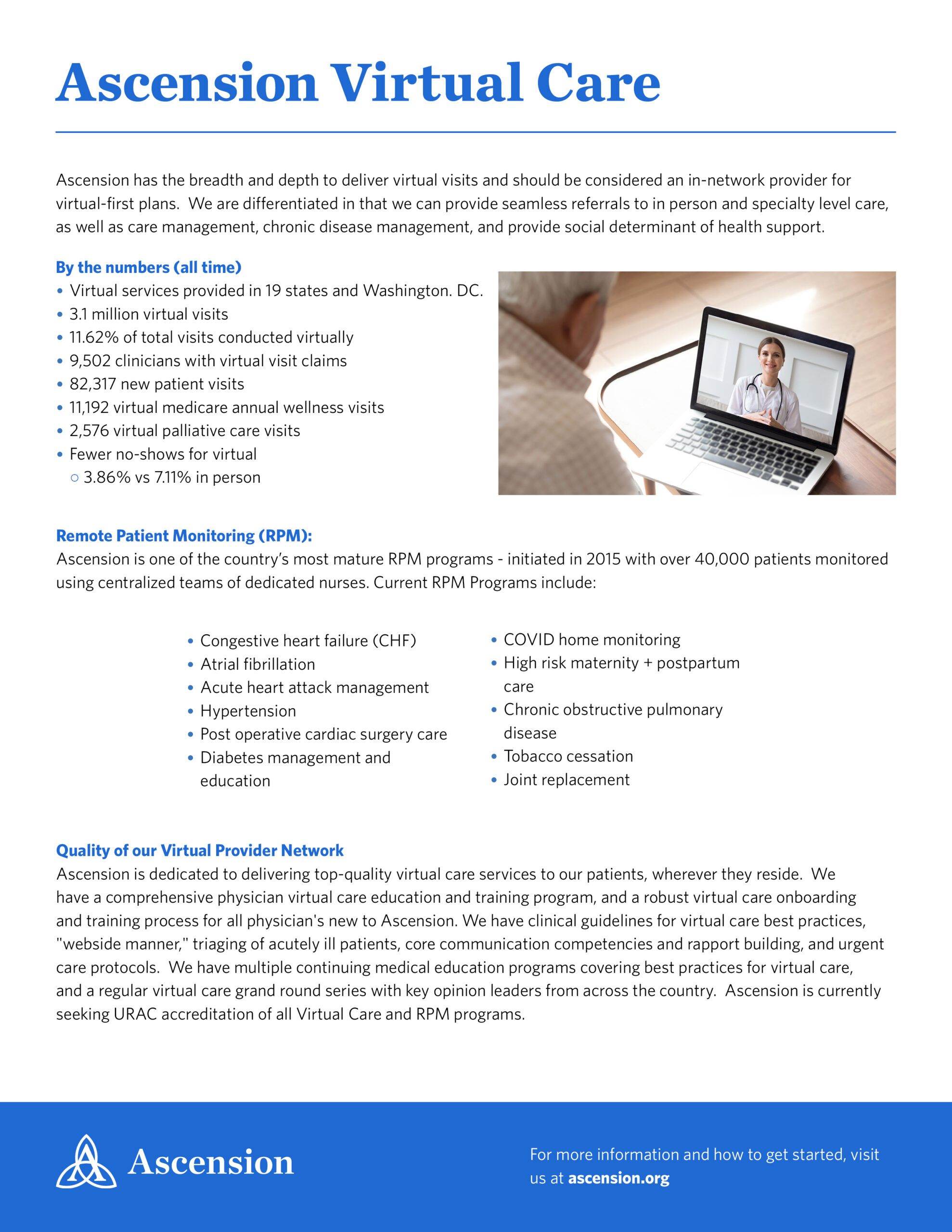
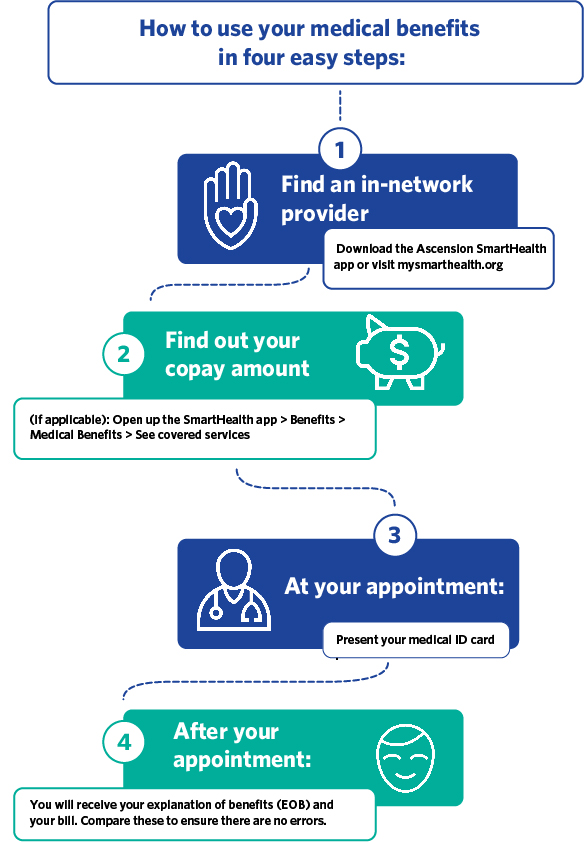
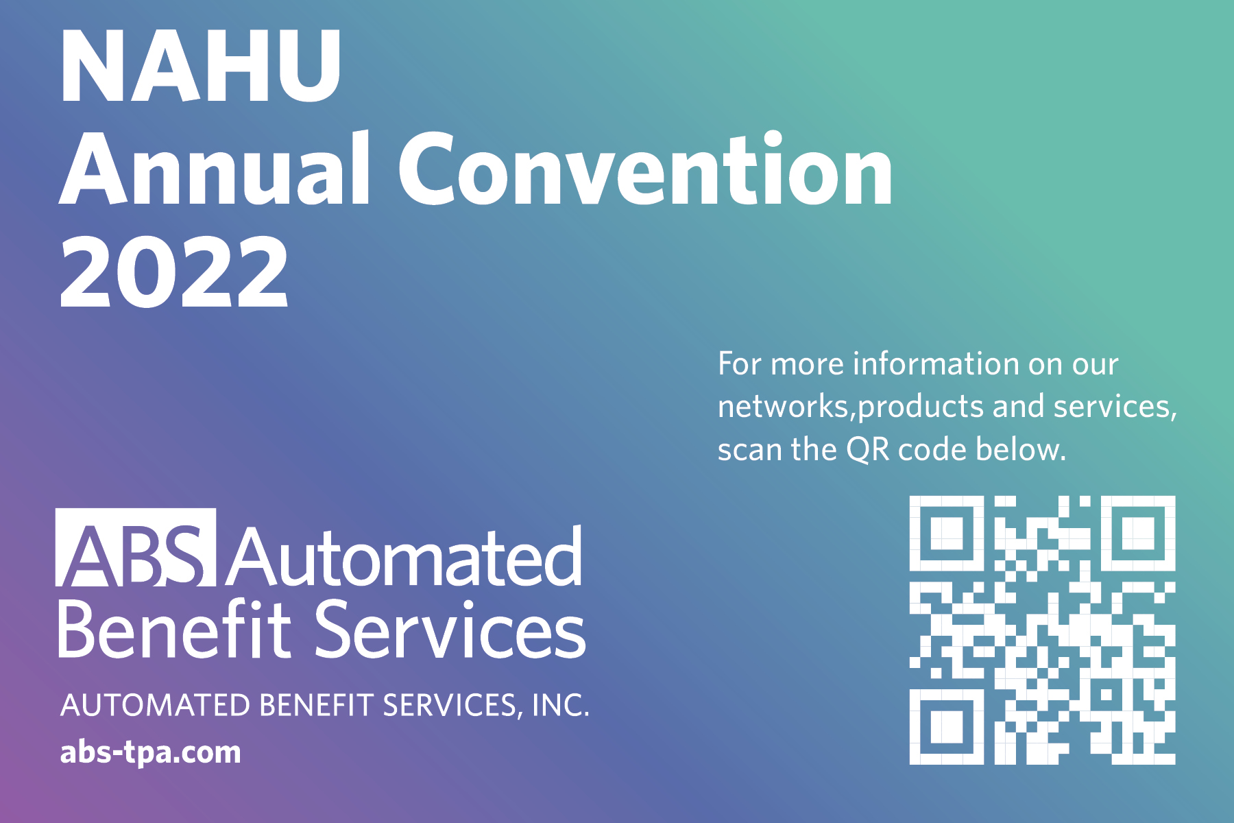
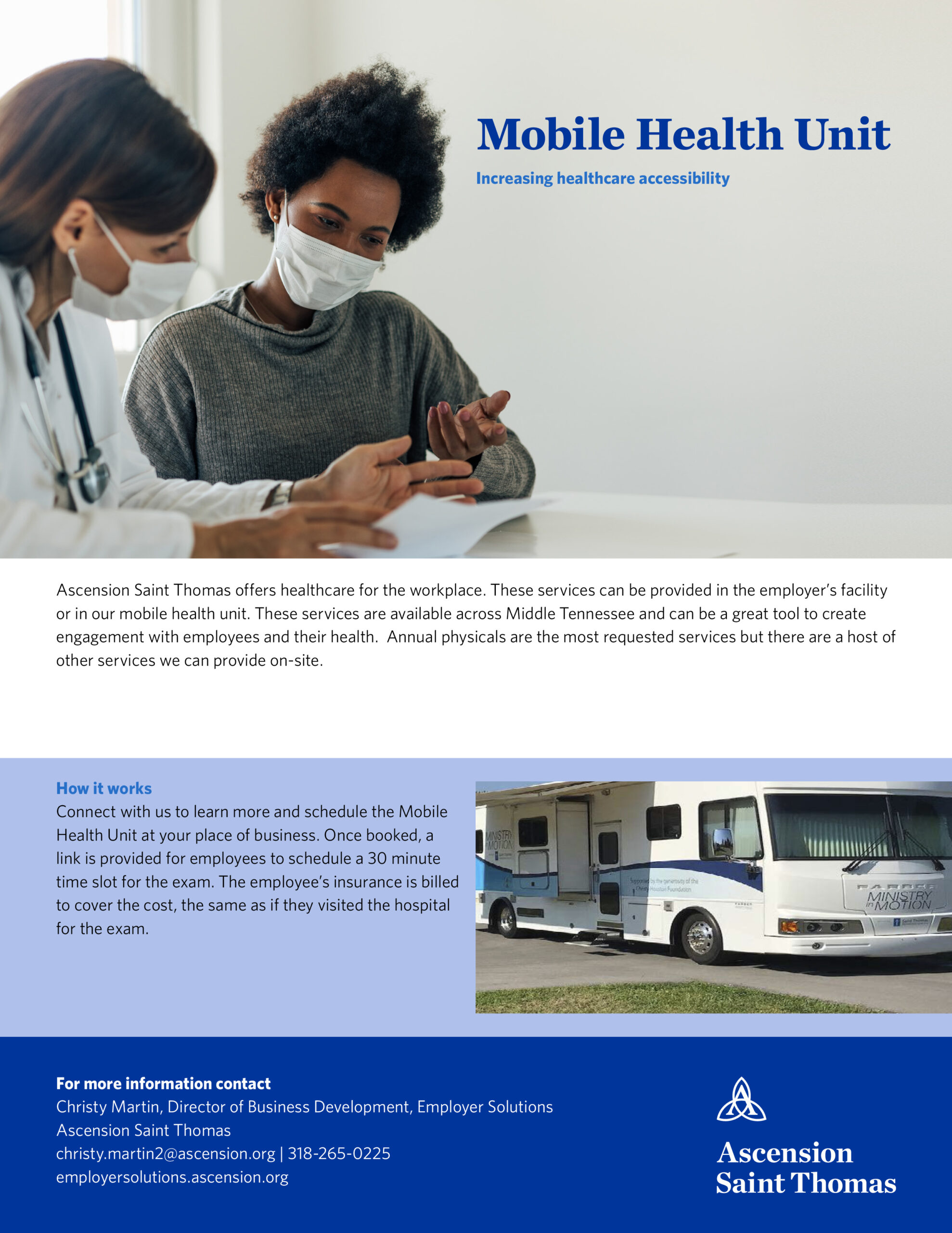
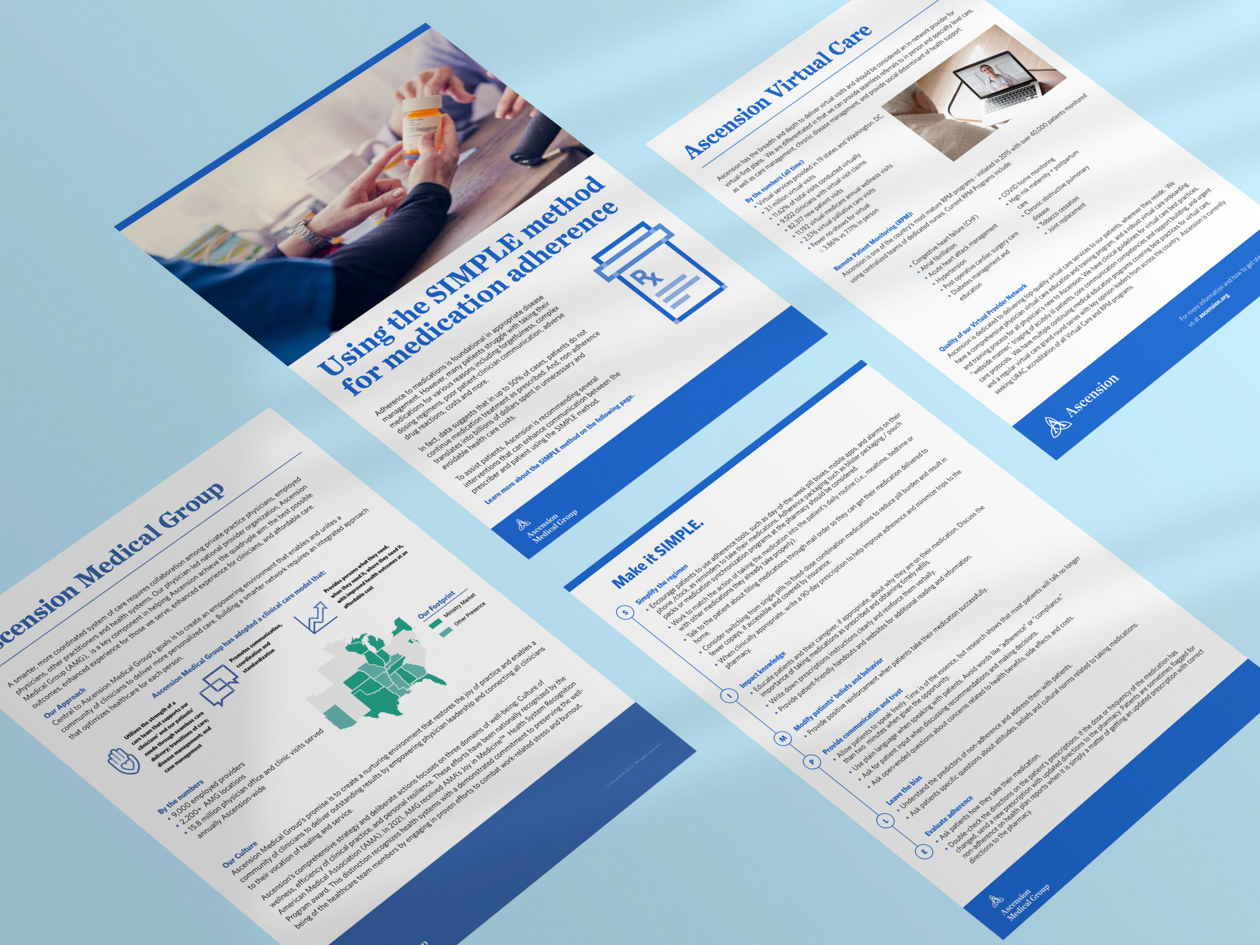
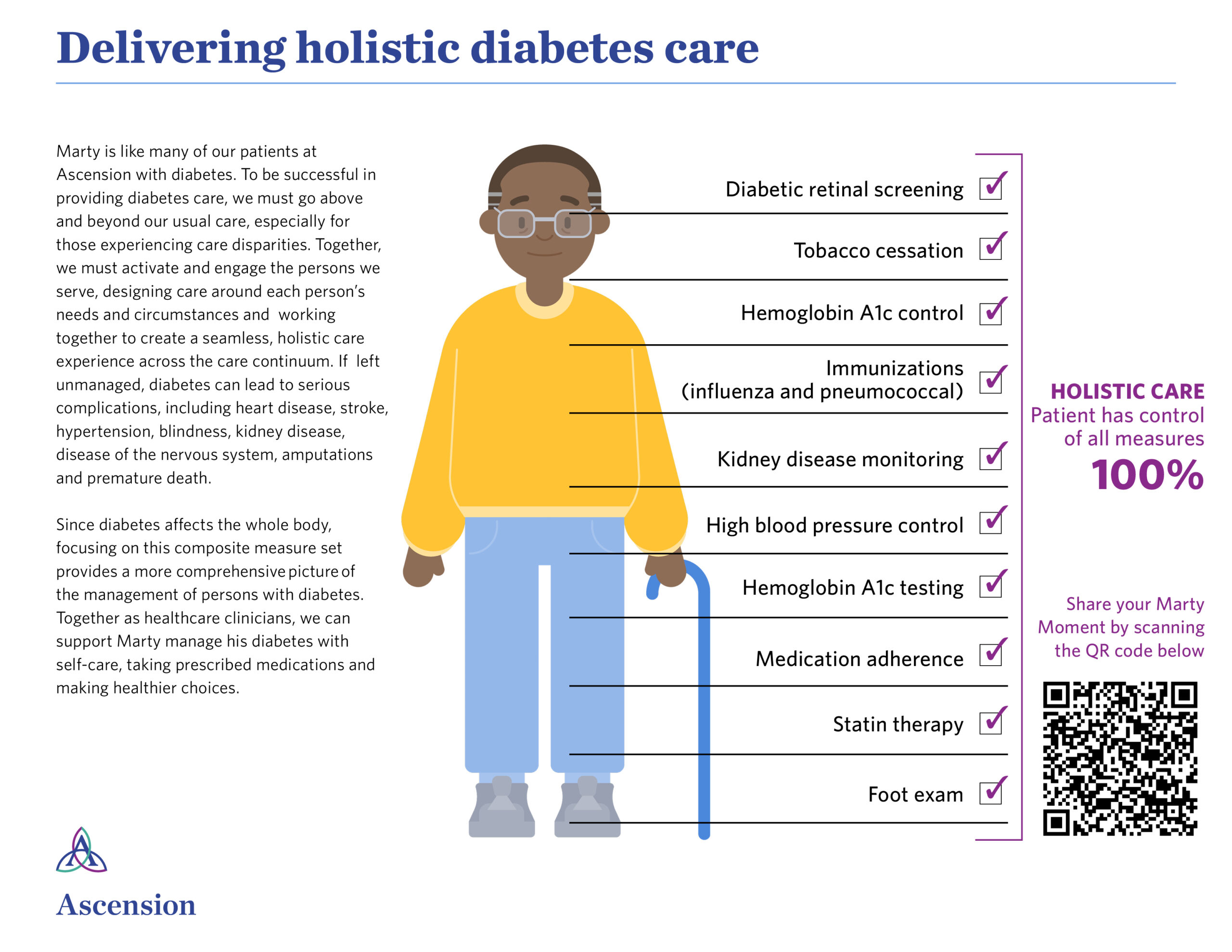
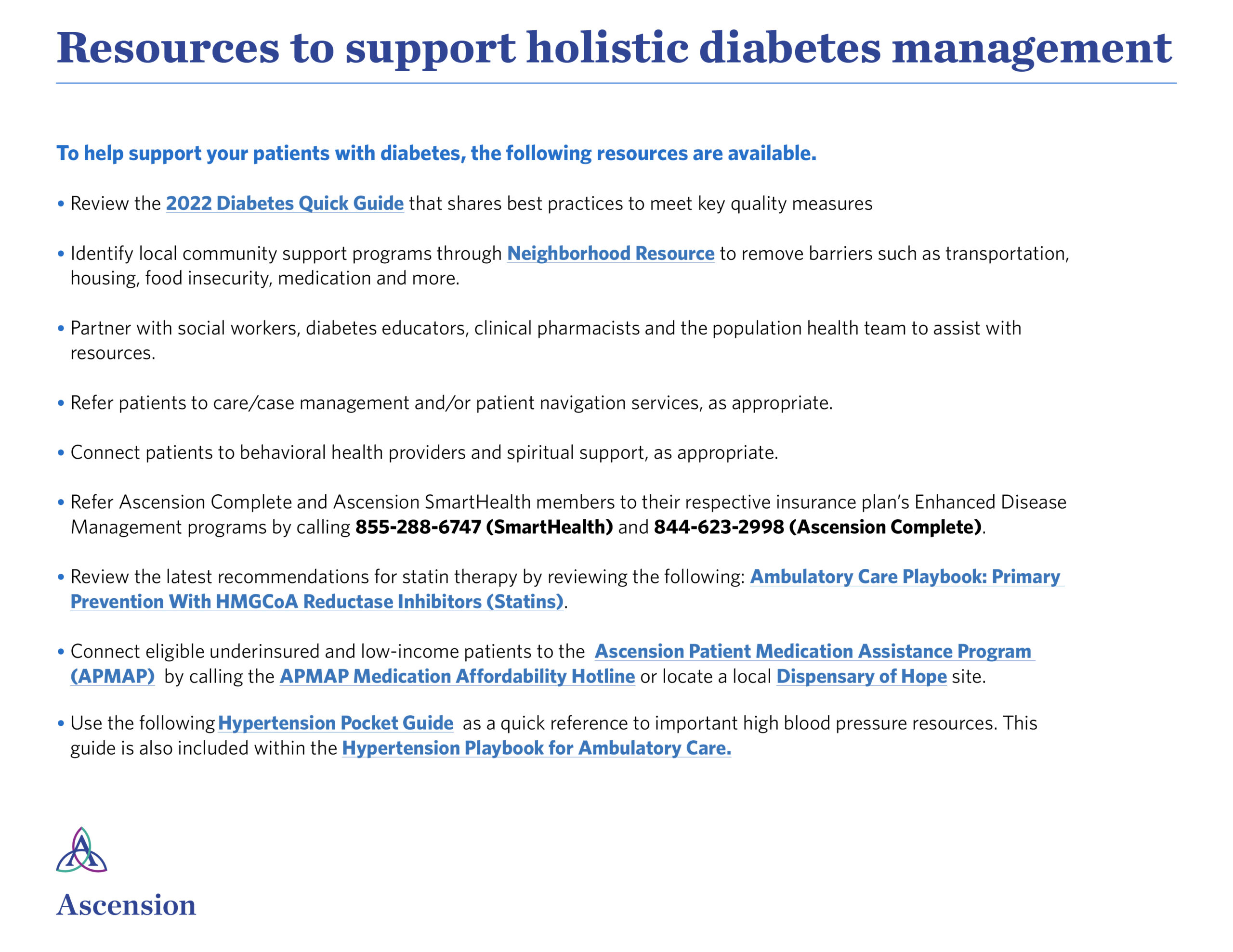
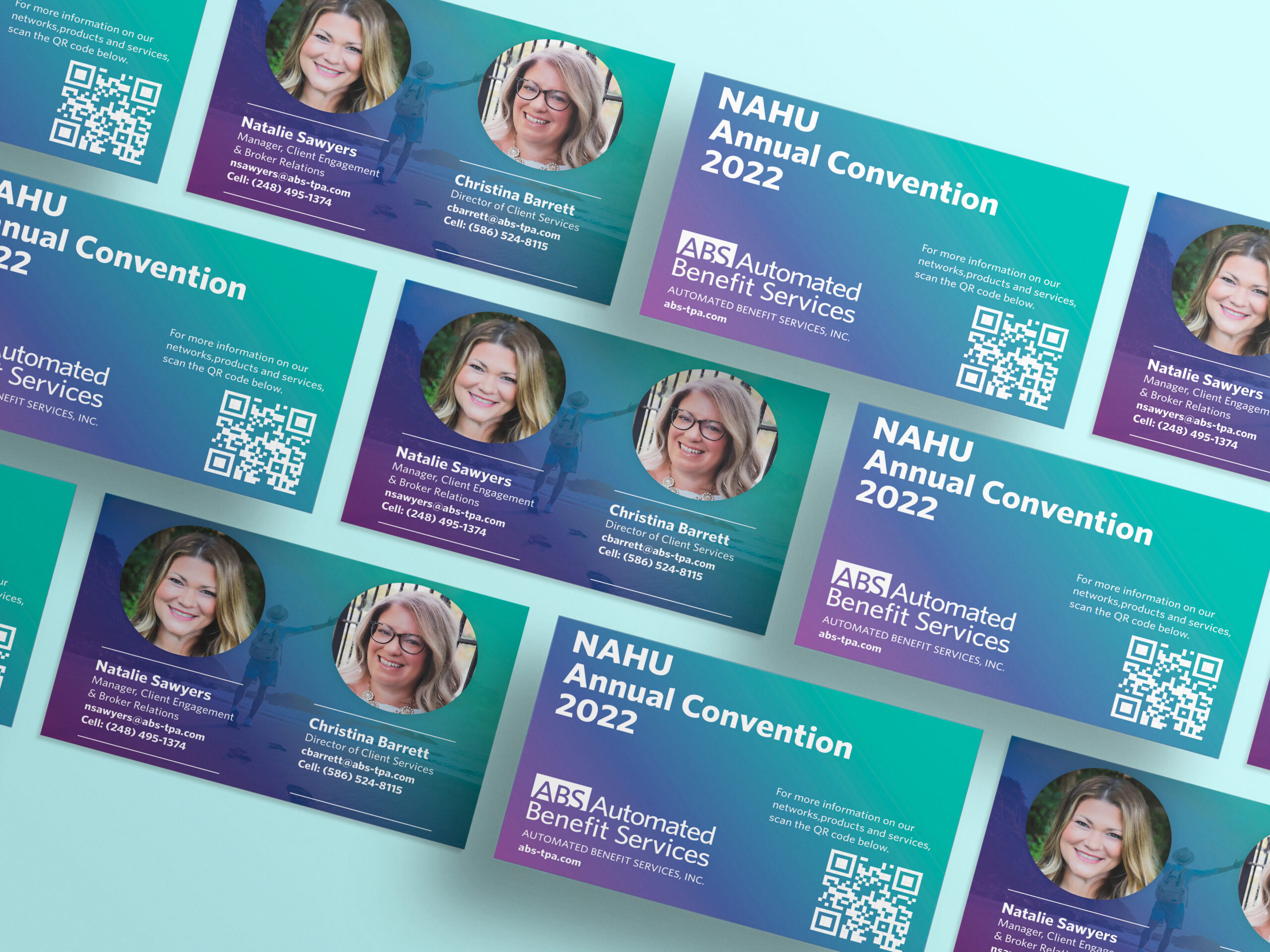
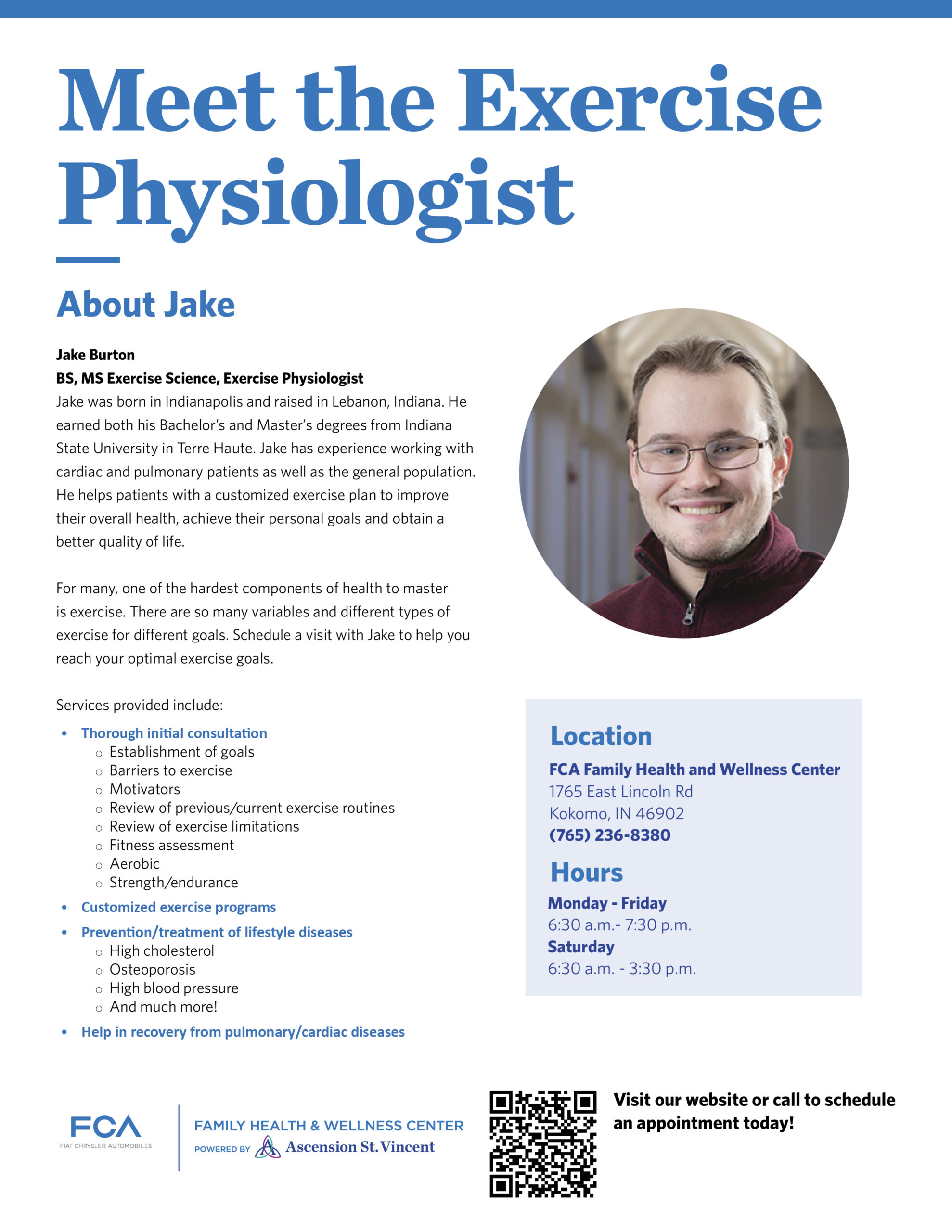
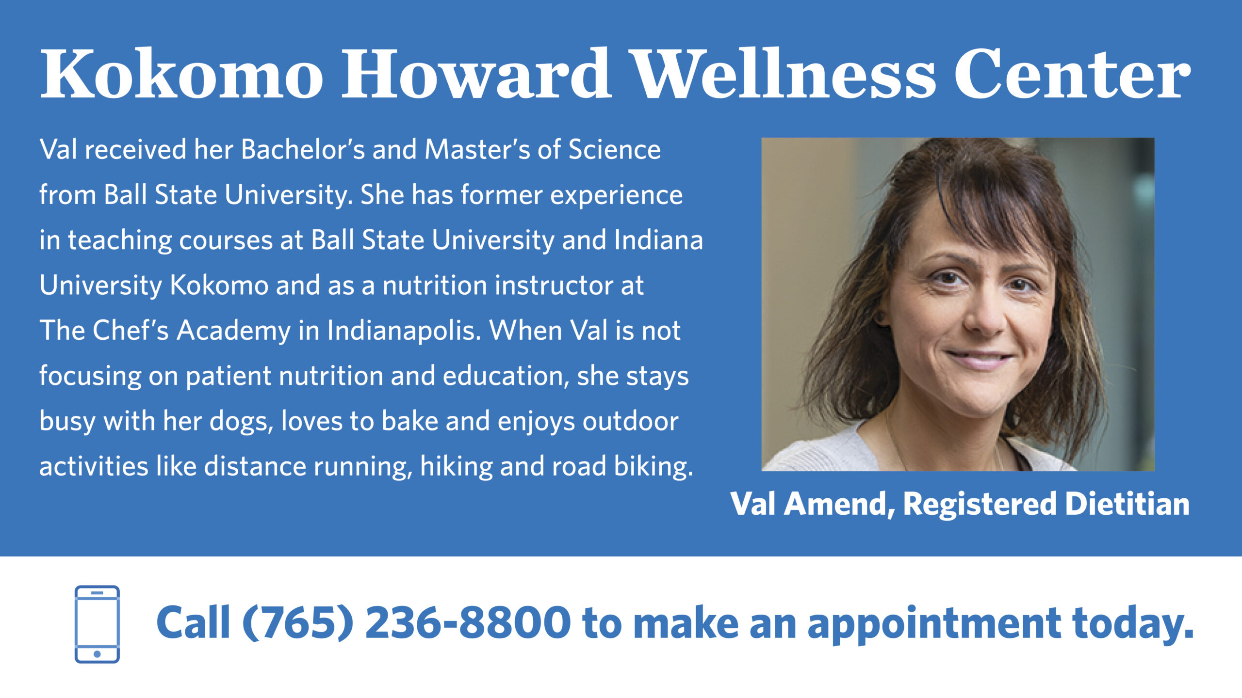
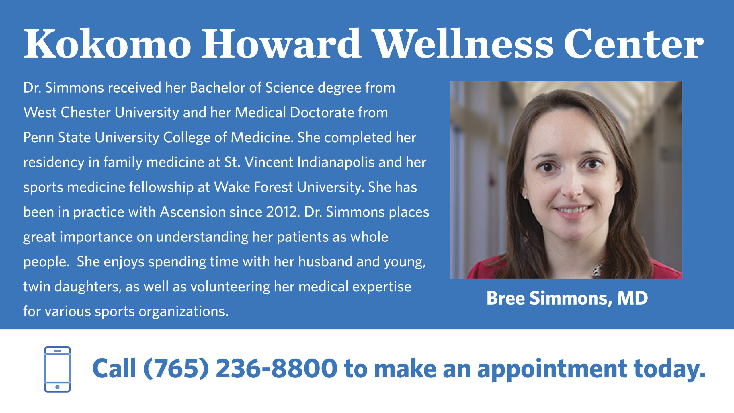
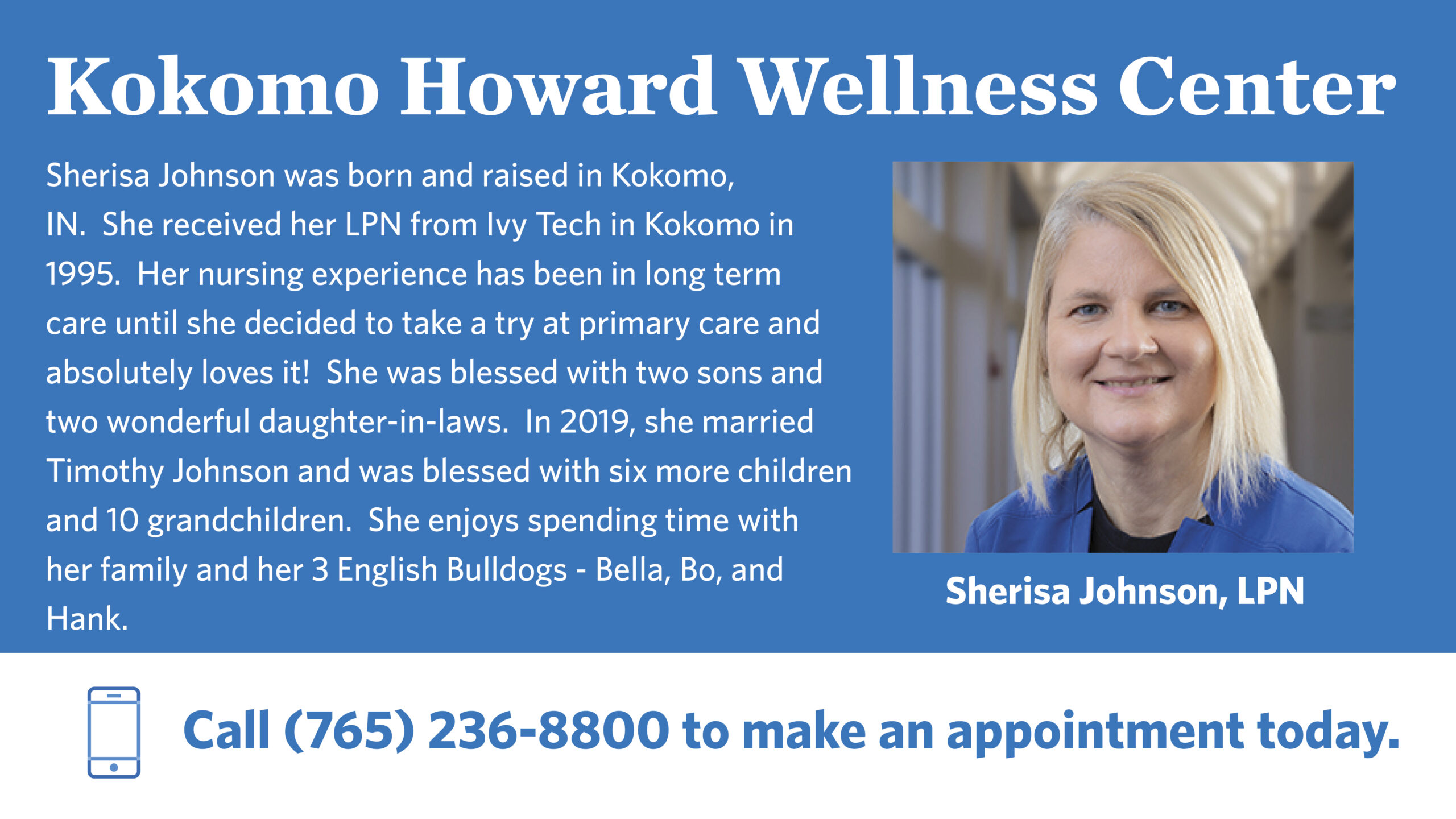
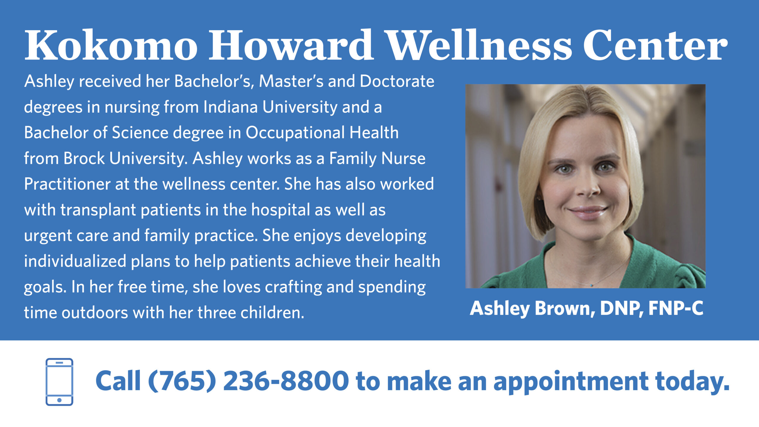
The Ascension Healthcare Brand was a complex and great experience for a graphic designer to expand their horizons while I was at Alder&Co. Ascension Healthcare is one of the largest private healthcare organizations whose brand and sub brands have specific guidelines. I learned to follow their brand guidelines for print, online, and documentation work. I made multiple flyers following their brand and subbrands, some include Ascension Medical Group and Ascension and ABS. They had different methods and setups for each piece of media. Their Flyers followed a simple hierarchy of color blocks and brand typography. Various flyers like the mobile health unit flyer use photography specific to the Ascension. However, their online media is based more on banners, iconography, slides, and infographics to help communicate with clients. The icons are huge to the Ascension brand that helps bring forward topics and ideas. My favorite piece I made for Ascension is the ABS business postcard for the NAHU Event, where I threw a unique spin on the idea of the business cards. The idea was ascension members wanted to hand out a type of print media that included the contact info but wanted it to be memorable. So I decided to make a post-business card mixing two ascension colors together and making it pop out among the many handouts given out at the event.