Red Cross CTA
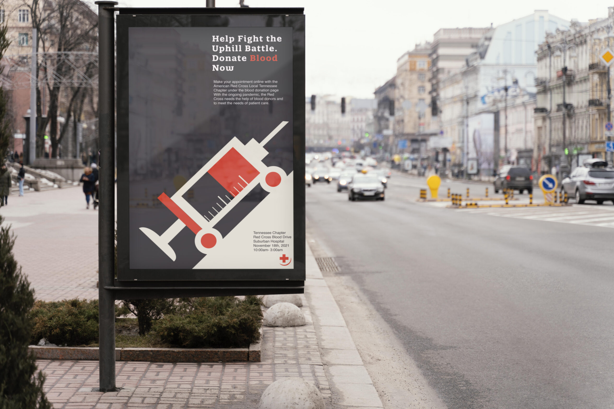
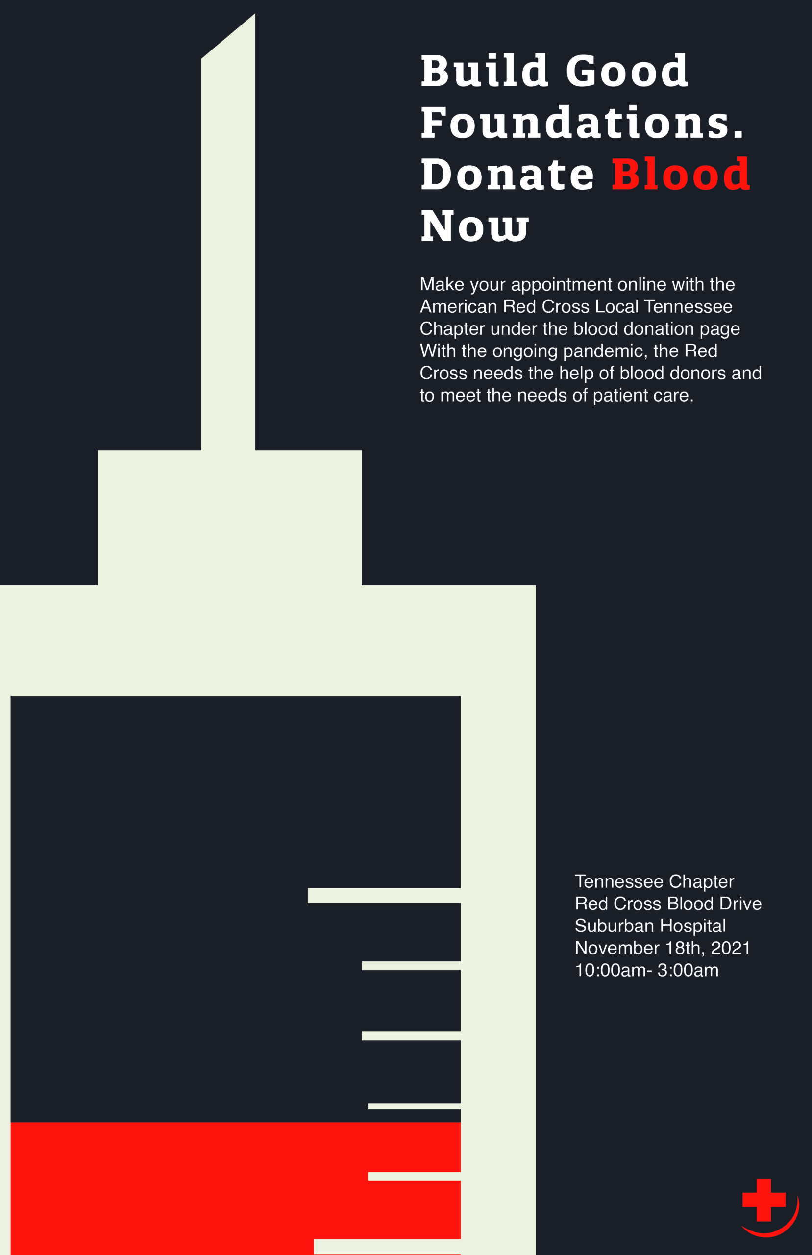
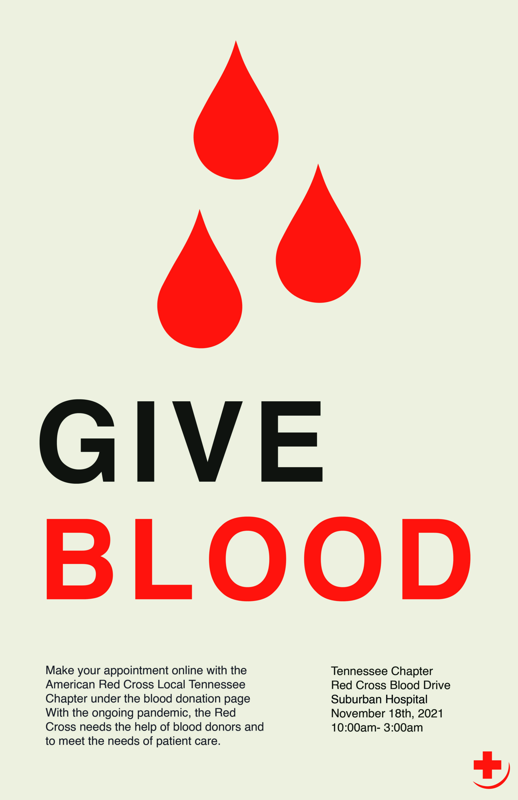
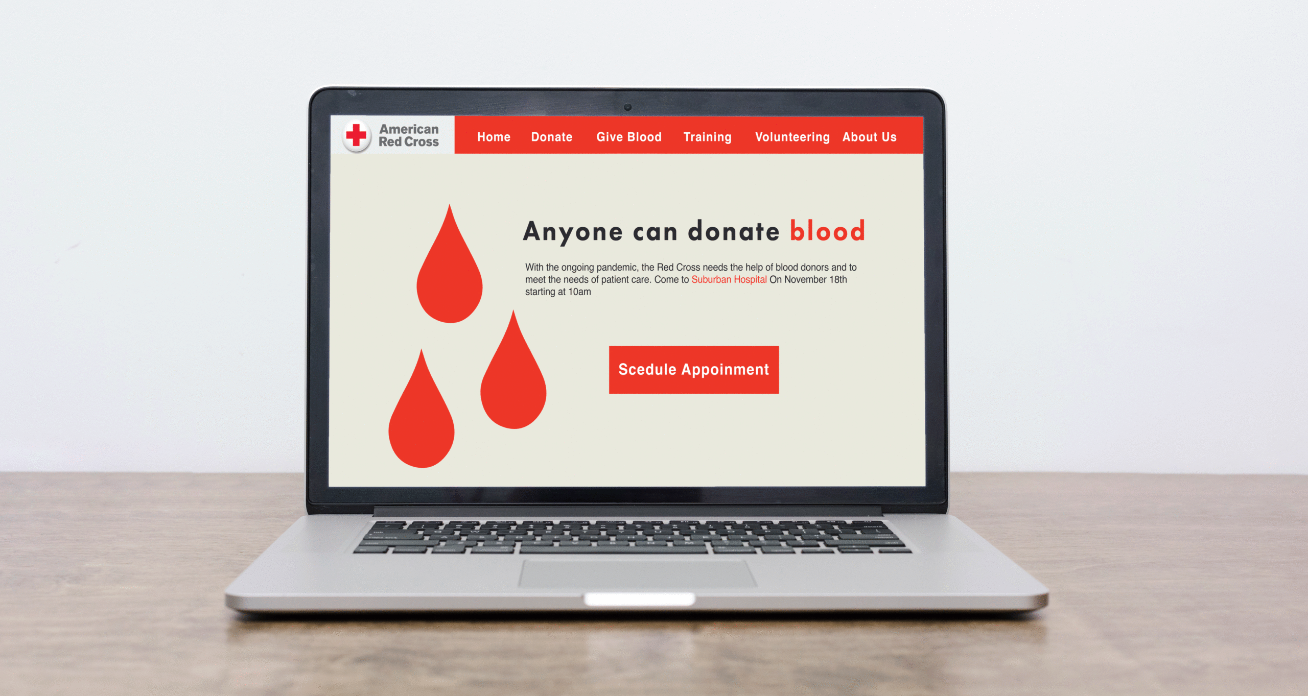
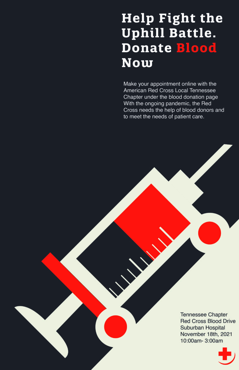
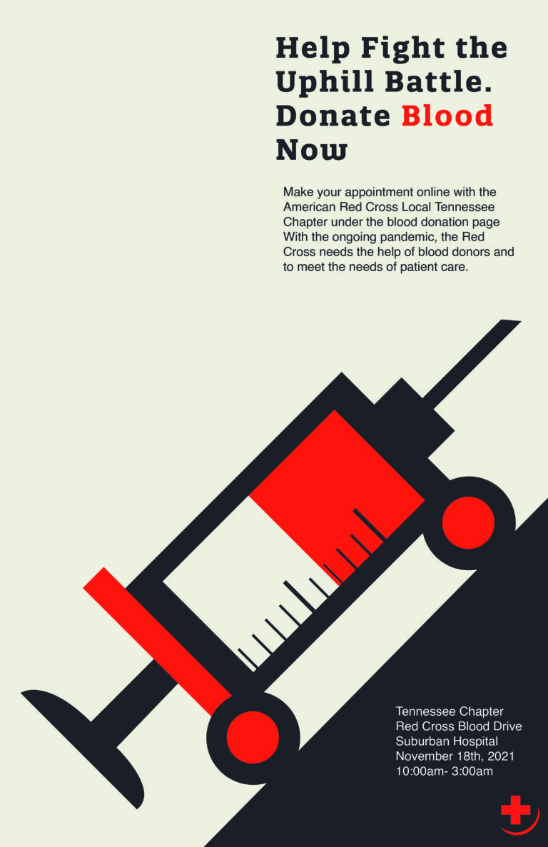
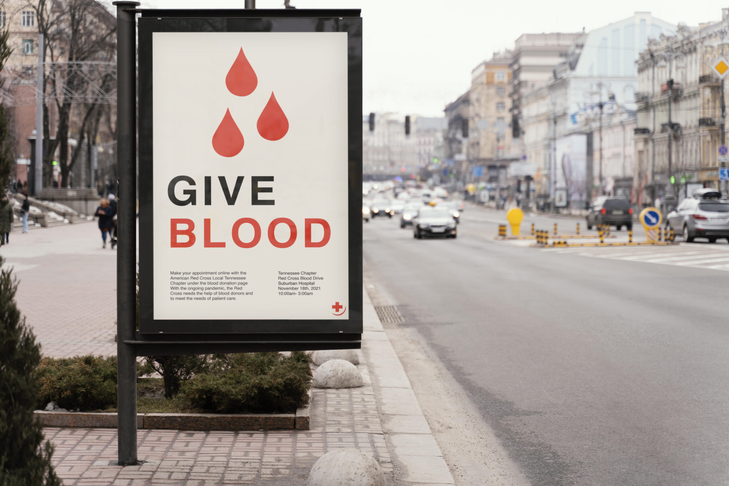
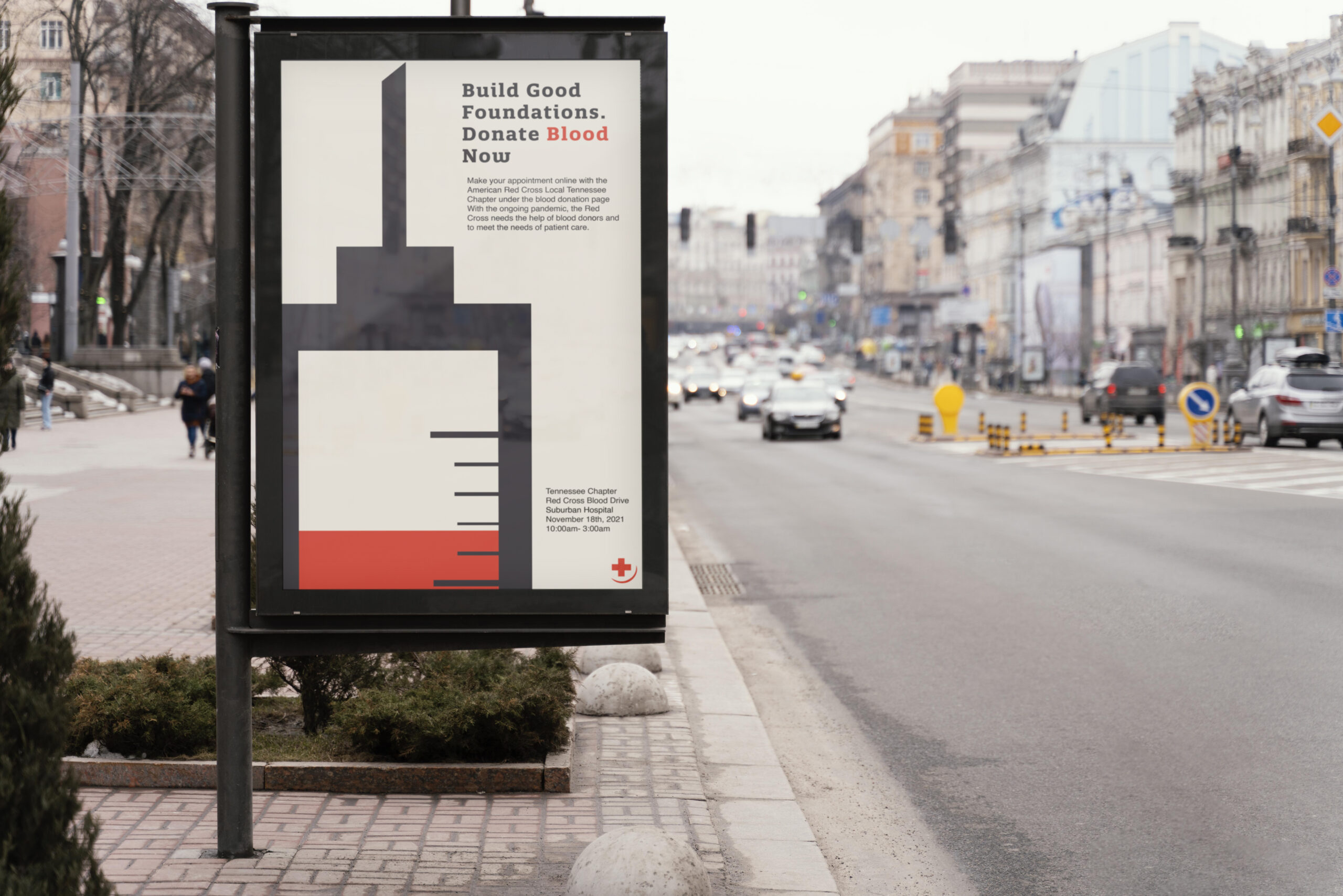
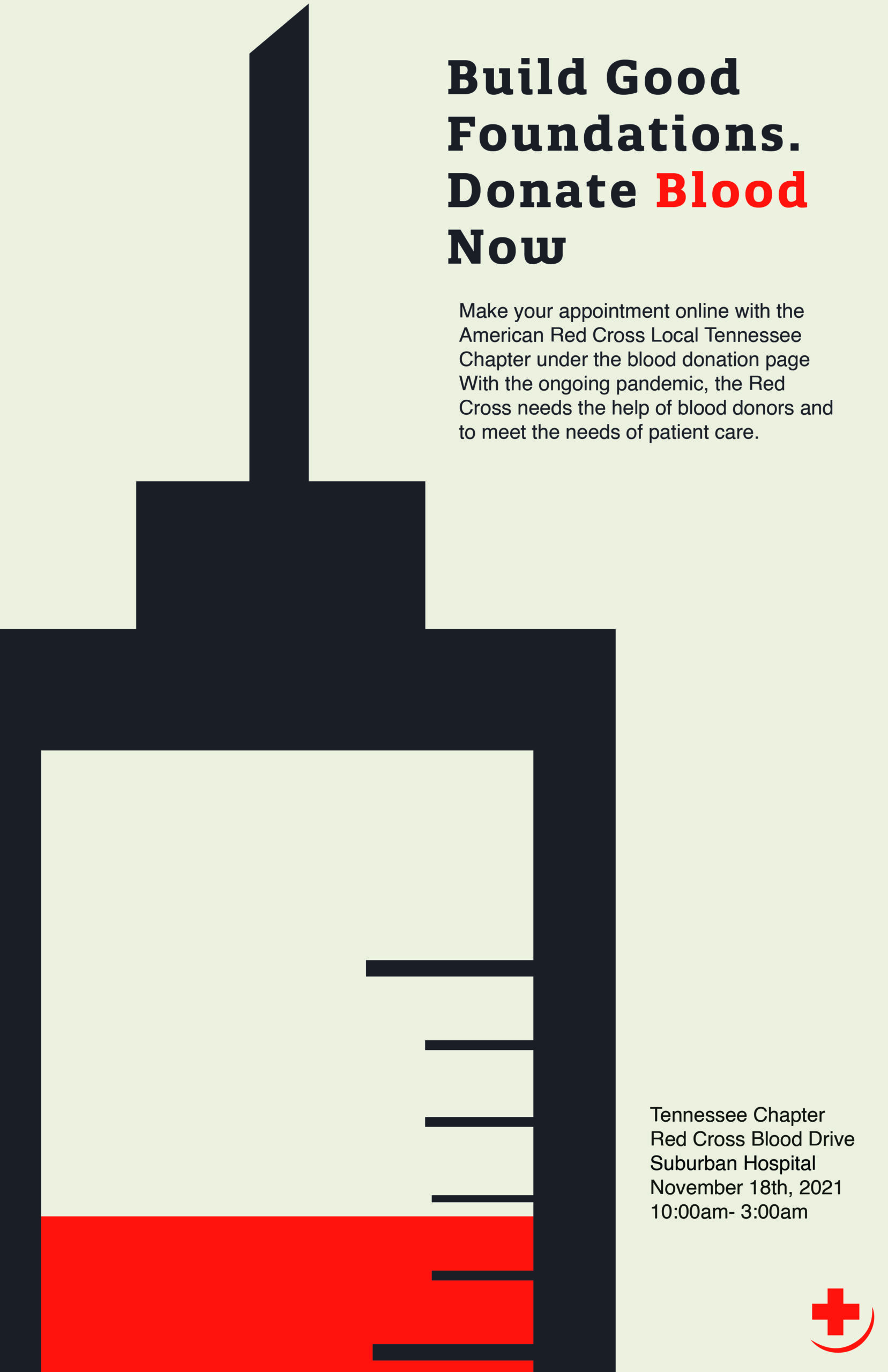
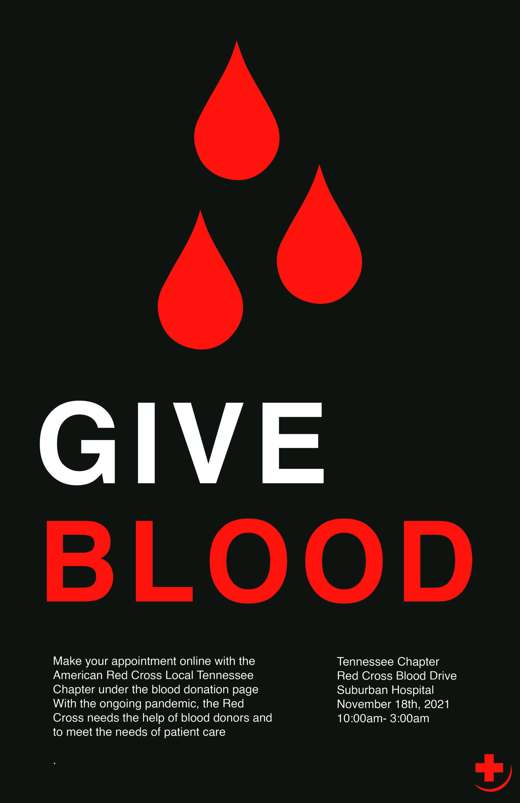
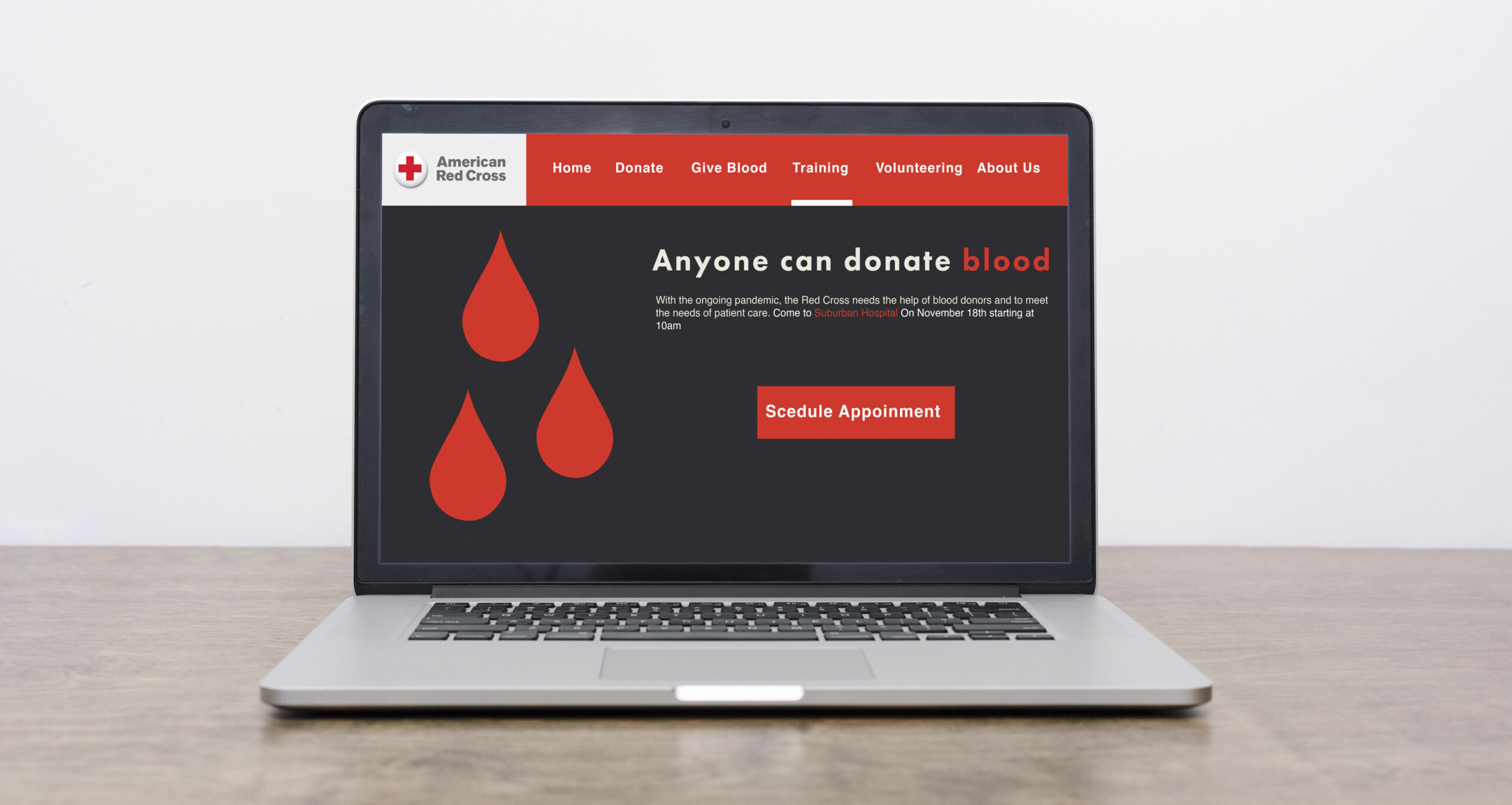
What is a call to action…well this project helped give me an idea. We had to create two calls to action for the Red Cross organization’s blood donation effort; a Poster and a web header. I researched some local blood drives coming up off the Tennessee local red cross chapter and some example CTA’s. I started to make posters in a simple swiss style with muted and bright colors, so the CTA of each would stand out. My Idea for the CTAs was “Give Blood”, then it slowly evolved into more meaningful words. Each poster had elements of the Red Cross organization as well as various plays on words . After Finishing My Poster I made a Mockup for a custom Web header to encourage people to give blood on all formats. I then went into Photoshop and mocked both the posters and headers. Overall this was a fun and exciting project I’m glad I gave it a shot…..
Riley's Portfolio
There are three responses to a piece of design – yes, no, and WOW! Wow is the one to aim for
